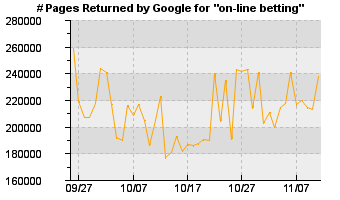
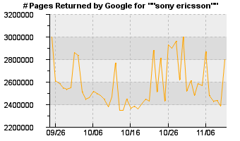
As some of you may know, I have set up a site, g-metrics.com that keeps track of the googlecount of various queries (users can add their own). This way you can see how many results google would return for a cetrain keyword for example, and how this number changes from day to day.
The other day I was wondering arround g-metrics when I noticed something very weird. The graphs returned for “on-line” * betting and “sony ericsson” are identical!


For me this is very strange since the two queries re not related. Well obviously they are in some way. Any ideas?
Is it possible that the graphs reflect more the overall traffic that google receives?They are absolute numbers after all – I think they should normalise those numbers against their daily traffic and plot query percentages instead (“today 0.04% of the queries where about bunnies”).